Optical illusions are always fun to behold. There is nothing more intriguing than staring at an illusion or picture that has you questioning your vision. Optical illusions have been a staple of art from the days of cavemen, but their modern counterparts have taken things up a notch.
Modern optical illusions are nothing but a towering display of creativity and genius. An artist spending numerous hours creating such art speaks of dedication and sheer will, and these illusions also tell us a lot about how the brain dictates vision.
Many such pieces exist, but let’s focus on 5 of the most popular ones.
Kanizsa’s Triangle
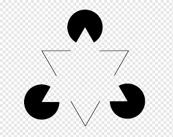
Conceived by Italian psychologist Gaetano Kanizsa, this illusion epitomizes the principle of the whole being greater than the parts. Here, you have three black circles surrounding an equilateral triangle. However, you also see a white inverted equilateral triangle although there are no lines indicating that there is such a shape. For some of us, the inverted “triangle” is more noticeable than the other shapes even though it is a construct of the gaps in those other shapes.
This illusion makes use of the Law of Closure. This states that when there is a break/gap in an object, the eyes will view it in a continuous pattern. We appreciate the whole as being greater than the sum of the parts. Therefore, when we view objects in isolation, we make sense of them by seeing them as a collective whole.
We see this Law in numerous drawings and paintings, ranging from the IBM logo to the World Wildlife Fund logo. We see these images without paying attention to their gaps, simply because of this Law.
Rubin’s Vase
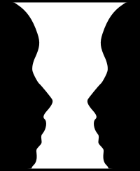
Two black faces or one white vase? Depends on what you consider to be the foreground and background of this image.
One of the most popular modern optical illusions out there, this image utilizes what’s known as the figure/ground principle. Your brain typically distinguishes between objects in the foreground and those in the background. The larger portion of the image is the “ground”, while the smaller portion is the “figure”. In an elaborately designed illusion like Rubin’s Vase, what constitutes the figure and the ground depends on the viewer’s idea of the foreground/background.
This optical illusion shows how the brain decides which object to focus on and which one to ignore. When you see an image with both a foreground and background, the brain instinctively fixates on the larger portion of the image as the foreground. What makes this tricky is when both figure and ground are of equal size, like what we see in Rubin’s Vase. A slight adjustment in the size of the foreground/background may create an illusion as a result.
The figure/ground principle is present in numerous iconic images and logos. It adds a certain complexity to these logos, and it makes them unique in ways we cannot readily describe.
The Boring Figure
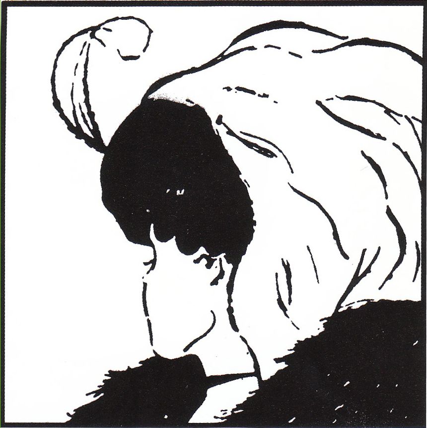
Yet another example of the figure/ground principle, this optical illusion is as trippy as it can get. Named after the American psychologist Edwin Boring, this image has two things going on at the same time. What makes this illusion compelling is the presence of two images all at the same time. Do you see a young lady or an old lady?
This optical illusion is disorienting because once a viewer sees one aspect of the image (such as the old woman), it is quite difficult to adjust their vision to notice the other aspect (the young lady).
This image, as well as Rubin’s Vase, are both ambiguous illusions. This is a type of optical illusion which causes the viewer to see two different images at the same time. Although the Boring Figure is similar to Rubin’s Vase, Edwin Boring felt the former was too simple for an illusion. He consequently popularized the latter illusion since he thought it would be more difficult for viewers to determine where one image morphed into another. The end product is an optical illusion so mindboggling that one’s age determines what they see.
.
The Impossible Fork
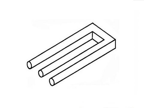
Comprising three cylindrical prongs from one perspective which morphs into two prongs from another angle, this illusion has dazzled many viewers. Obscure any part of the illusion with your bare hands, and you’ll either see a three-pronged illusion or a two-pronged structure There is no consensus on why this illusion exists, and it is regarded as an impossible figure.
In a similar fashion to the two previous images, the Impossible Fork is another example of an ambiguous illusion. It is also a cognitive optical illusion because while most other images focus on only your vision, this type also plays tricks on your brain. It toys with your cognition and therefore requires a lot of concentration to fully observe.
This illusion also uses the figure/ground principle because of the relationship between its foreground and background. What constitutes the foreground or background depends on the viewer’s perspective, although it is a more complex illusion than these other images.
The Café Wall Illusion

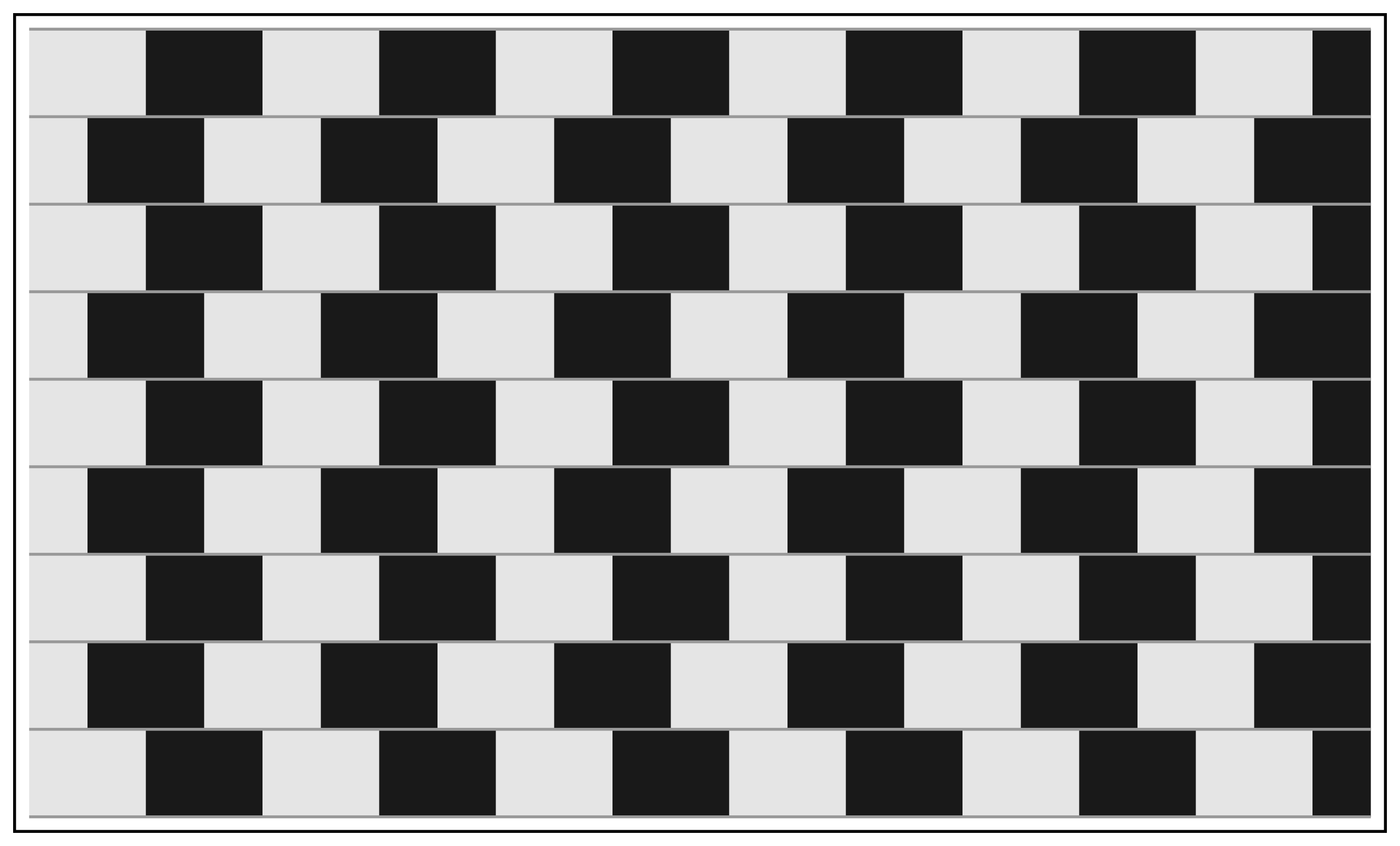
First taken from a café wall in Bristol, this is a physiological optical illusion which tricks the onlooker’s vision. Here, the viewer’s eyes are over-stimulated with visual impulses, causing one to see an image differently from what it actually is.
The café wall illusion is one of many illusions that manipulate how parallel lines are observed. In this image, the grey lines are actually parallel to one another. They only appear slanted due to the crooked arrangement of the black squares. Interestingly, the image stops being an illusion once the lines are changed from grey to black.
This boils down to the luminance (colour contrast) of the illusion’s components. Colour contrasts between components of a symmetrical image cause the neurons in our visual cortex to see an asymmetrical image. With the café wall illusion, there’s a visible colour contrast between the white background, black squares and grey lines. This causes the grey lines to seem as though they zig-zag, although they are parallel.
Spell-bound
Modern optical illusions are an innovation of age-old art. Apart from the tricks they play on our vision and cognition, they also incorporate design principles seen in other forms of visual art. For example, the Law of Closure, while used in an optical illusion, is also seen in various visual art styles. They are so commonplace that we barely notice them. Regardless, illusions present interesting case studies of how design principles converge to create the most spell-binding art.

